Could everybody please calm down about naming your company or your choreography? Sure, it’s fun to play around with the punctuation marks on your keyboard. But invented punctuation doesn’t guarantee inventive choreography. It’s just punctuation run amok.
For some people, the regular flow of upper and lower-case font doesn’t project the CONFIDENCE they feel about their enterprise. The solution? All CAPS. We’ve seen it in Alonzo King’s LINES Ballet and MOMIX. Now we’re seeing it in MYOKYO, iMEE, and T(H)RASH, not to mention FULL.STILL.HUNGRY.
Which gets us into another area of Punc Amok: dots gone wild. In the old days, you knew you reached the end of a sentence when you saw a period. Now these dots are scattered willy nilly. Observe Chu. This. , piece.piece, and Kara•Mi.

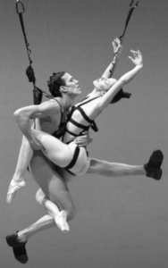
Marie Chouinard’s piece with the complicated title
Back to the wayward CAPITAL letters. It seems some people are using them as a design element. See the San Jose–based company sjDANCEco, the all-woman company ChEckiT!Dance; Lauri Stallings’ group in Atlanta, gloATL; and possibly the most perfectly patterned use of CAPS,
bODY_rEMIX/gOLDBERG_vARIATIONS, a 2005 piece by Marie Chouinard (or should I say, mARIE cHOUINARD)
Then there’s the opposite: those who insist they are too modest to use capital letters at all. Thus we have NYC choreographer luciana achugar, whose name is spelled “correctly” by presenters like New York Live Arts and Danspace but not by publications like The New York Times or Time Out New York that have to stick to style codes.
Some are pushing the envelope of those two vertical dots that are intended to introduce a particular example. I have to list these vertically or else it will upset my colon.
:pushing progress, a company/a workshop
MOVE: the company, in Vancouver
Lang: Music + Lang: Dance., a piece by Jessica Lang
Then there’s the breakthrough discovery of the double colon by Chafin Seymour for his seymour::dancecollective.
One company that’s had to eat its words, or non-words, is Les Ballets Jazz de Montreal. They thought it would be cool to abbreviate their name and put it in brackets. But apparently nobody recognized [bjm] as a dance company so they had to change the name back again.

Justin Peck’s Rodeo: Four Dance Episodes, photo @Paul Kolnik
The latest zinger is the title ‘Rōdē,ō: Four Dance Episodes, Justin Peck’s premiere for NYCB last season. It sends writers and editors scurrying to find obscure marks on a keyboard or on the internet. Of course one could refer to the ballet like so: “Rodeo, with long marks on all the vowels, a single quote mark before the R, a comma after the E, and a colon after the O.” By that time, no reader would want to see this ballet, which is actually quite fabulous.
Deborah Jowitt called Peck’s title “diacritically enriched.” So…to feed my ongoing Punc Amok obsession, what’s YOUR favorite diacritically enriched title?
Featured Uncategorized 8
There was also tEEth in Portland, Oregon, now defunct. The spelling was on the whole more creative than the choreography, although it had its interesting dadaistic (dADaistic?) moments. Thanks Wendy, I appreciate this tweet…
My favorite? Merce Cunningham’s “BIPED.”
Here’s an excerpt from his company performing in Moscow:
https://www.youtube.com/watch?v=b6QcBPexhRk
AH! I should have read your post before making mine.
I think Bill T. Jones’ titles are largely responsible for encouraging this.
Slashes:
Serenade/The Proposition
Chapel/Chapter
WORLDWITHOUT/IN
Power/Full
Still/Here
Last Supper at Uncle Tom’s Cabin/The Promised Land
Colons
Another Evening: Venice/Arsenale
Another Evening: I Bow Down
Ellipses
Fondly Do We Hope…Fervently Do We Pray
As I Was Saying…
and before…
There Were…
We Set Out Early…Visibility Was Poor
There Were So Many…
Holzer Duet . . . Truisms
Exclamations
Ah! Break it!
How! Do! We! Do!
Periods
M.A.K.E.
[ditto ” ” ” !]
Since I’ve been spelling my name with lower case letters since junior high school (at the time I thought it was distinctive, now it’s silly, but it’s mine and I feel like I should be true to the choice I made) I can’t really feel superior about this. I will say, though, that the Canadian postal codes are designed to alternate between upper and lower case, since they alternate between letters and numbers — they are indeed a pain to type, especially if you’re making a mailing list.
I am most irritated by the Portland dance company name tEEth
Perhaps you’d be happier if they could tip over those capital E’s.